During the fall of 2015, master and bachelor students of design at HDK collaborated in doing the exhibition Promiseland. Master students created design pieces and bachelors curated, promoted and did spatial design. Joining the Visual Identity group, I crafted posters and folders. Fonts, colours and visual elements from these were used in navigation within the exhibition.
We promoted the exhibition as showcasing the latest design work by HDK masters, without a word about the real goal of the show. The poster mimics contemporary graphic design, but once you've visited the exhibition, you realize it actually stands for something else. The objects exhibited were provotypes, made to sparks discussion about migration. Themes ranged from the European Unions view on refugees (a suicide kit to cut costs) to the importance of family when you are forced to move (two armchairs in need of a table to function). Drawing on these many different perspectives, we decided on symbols connected to migration. The gradient stands for blurring out borders between countries; the pink lines and dots are the routes of migrants; the rectangle is the A4, hinting to the paper work needed to expel or include human beings in a country.
Huge piles of A4:s towered in the passport control-like entrance of the exhibition. Essays explaining the provotypes were held in folders resembling classic bureaucratic ones.
Collaboration with Björn Selin, Lisa Rydqvist and Elin Hesselstrand
Collaboration with Björn Selin, Lisa Rydqvist and Elin Hesselstrand
http://www.promiseland.se
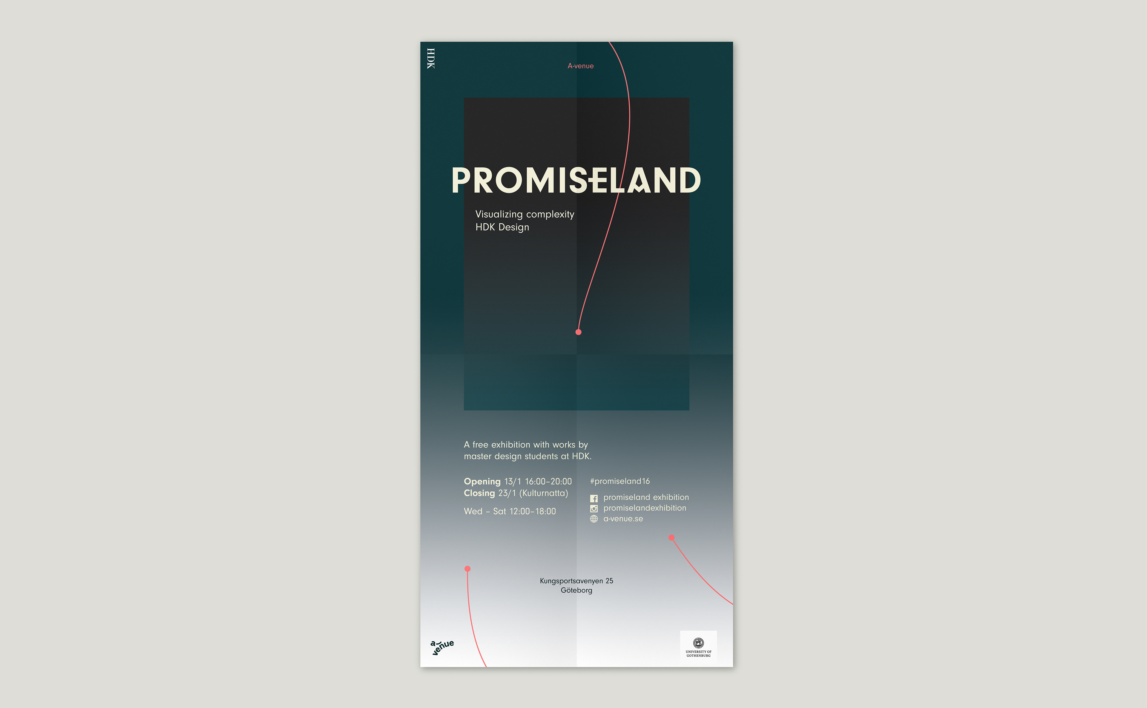
Exhibition poster, 594 x 420
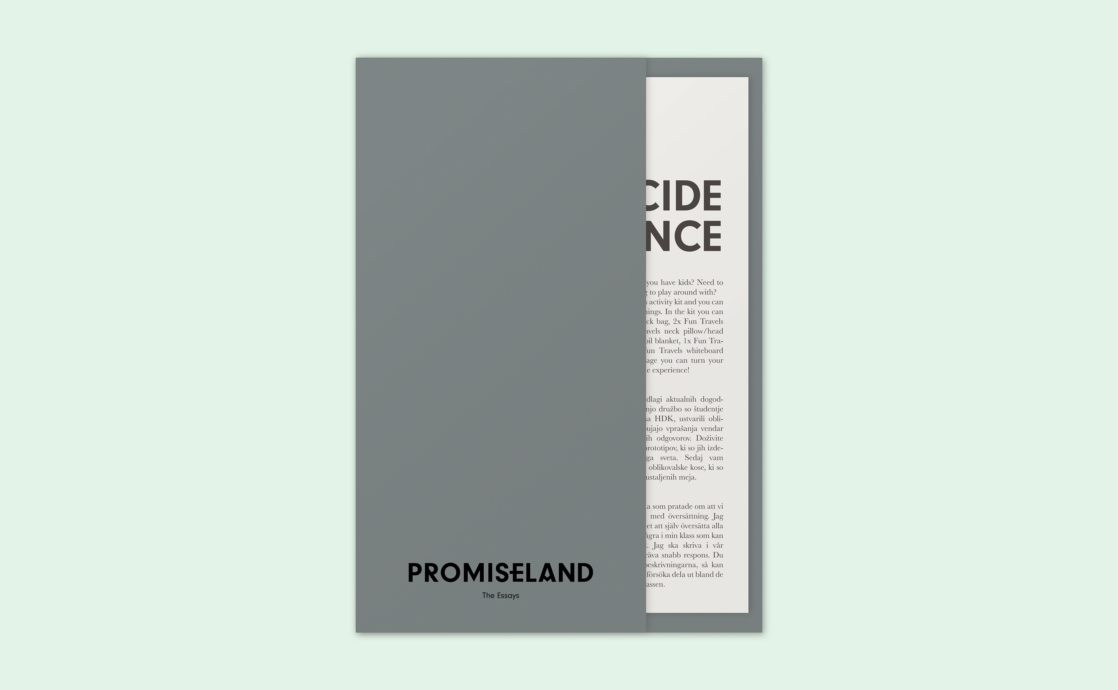
Folder holding master students essays